
Has AI already taken over the field of design?
Definitely not, is the quick answer. When ChatGPT and image generators like DALL·E, Midjourney, and Stable Diffusion started gaining wider popularity around last New Year’s, there was a lot of excitement and anxiety in the air—and it indeed caused a storm in the fields of illustration and photography. However, by the end of 2023, AI hasn’t really made a significant impact on the field of UX/UI design. Statistics also show that AI is only used to a small extent for UI design. AI simply hasn’t yet made its way into UI design tools—it’s mostly helpful for background tasks and content generation.
So, what do we actually have for a UX/UI designer? Framer has an AI generator that builds a website right in front of the designer’s eyes based on a prompt. But the results tend to look quite similar—it focuses more on generating content like text and images. There are actually several such tools, and even better ones. For example, 10Web, a website builder with WordPress content management—while you can’t really design much yourself, it’s pretty great for quickly setting up a site for a typical business owner. Or tools like Style and Durable. In Wix Studio, AI can help make the website responsive—automatically adapting the design to different screen widths.
Uizard can turn sketches into UI designs, making it great for quick prototyping. There’s also been some buzz on Twitter about a Figma plugin in development that generates a website layout. It seems like there’s a lot happening in the no-code and low-code space right now, and just today, I saw one no-code app builder launch its own AI generator.
Basically, every week we get a new generator. The existing tools are suitable for idea generation, content creation, or at best, putting a website together in some form. Imitation, not creation. So far, I haven’t seen a serious tool that would send designers on vacation.
There are many testers. Given the general AI race, could it ironically happen that, for example, Microsoft ends up creating the best web-building tool? With Bing Chat, they’ve managed to make even simple GPT confusing and annoying for users, so it’s likely that the solution will come from a more designer-friendly organization. Adobe and Figma are already experimenting together, and Figma’s CEO has a vision. Something might come out of that, once the hype fog clears and they get a clearer picture of what users actually need.
While writing this article, ChatGPT opened up the possibility of creating personal GPTs, or apps. It’s likely that something more practical for UX/UI design will come from this.
The web user environment is changing
Lately, projects have been emerging that ask more general questions about where we use the web, what the web even is for the average user, and how it can be improved.
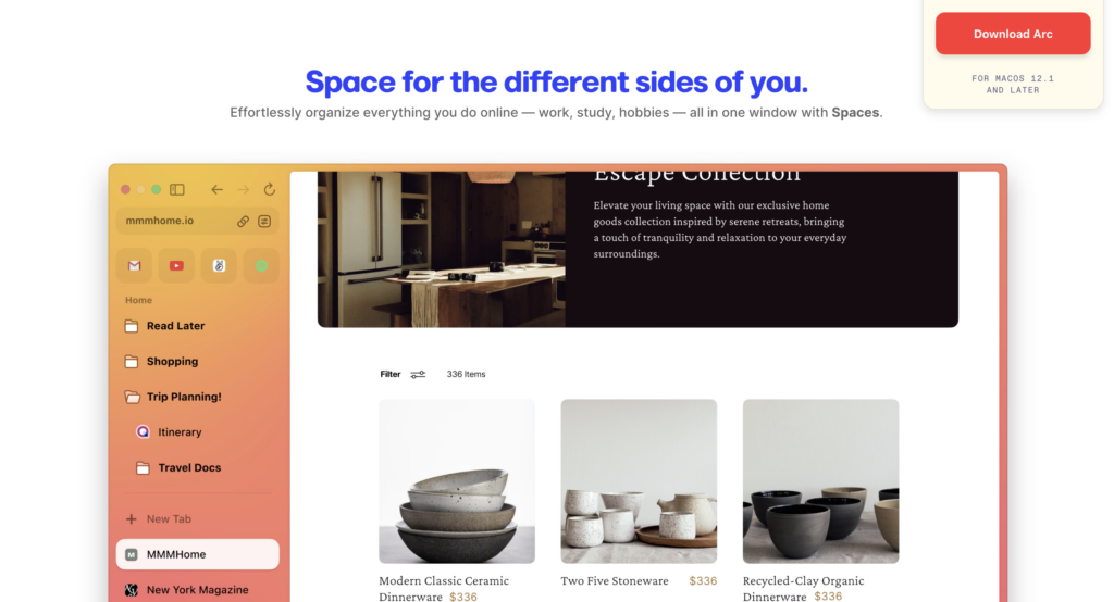
There’s a discussion that today, a browser is quite a clunky interface through which we, as users, essentially have to fight our way through the digital world with “boxing gloves” on, trying to connect and organize things. Browsers and operating systems in general treat each web app as a separate entity with its own rules. In reality, the digital experience could be much more seamless, where the entire system adapts to the user. Systems should be able to exchange data in the background, and users should be able to freely move data around as needed.
There have been alternative browsers created for tech enthusiasts before, but now, the Arc browser has gained significant attention. This browser is advocating for such a philosophy, looks great, and is even converting some Mac users to its cause. (See its review.)
Dot and Space OS aim to do the same at the operating system level. Flexibility, personalization, AI-generated micro-apps on the fly based on the user’s needs, etc. Gradually, all major browsers and operating systems are doing this, for example, AI support called Copilot is already built into Windows, including Edge.
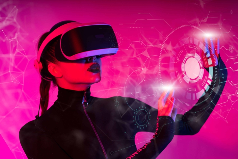
The announcement of Apple’s Vision Pro brought the VR/AR topic back into the news cycle. It will likely remain a playground for enthusiasts. As a side note, does anyone even remember the hype about Meta’s parallel world migration? Jokingly: even elderly people were scared into thinking it would be happening soon, as they were told on Vikerraadio in broad daylight that they’d have to leave soon, no matter what…
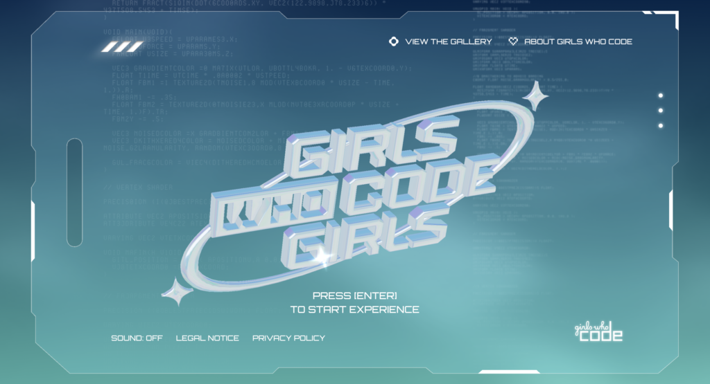
In design circles fond of effects, visionOS’s detailed spatial UI solution and its promotional images, in general, sparked a new wave of glassmorphism. Semi-transparent matte glass surfaces, subtle spatial effects, and similar elements are still popular even on regular websites.
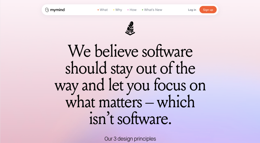
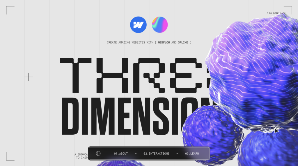
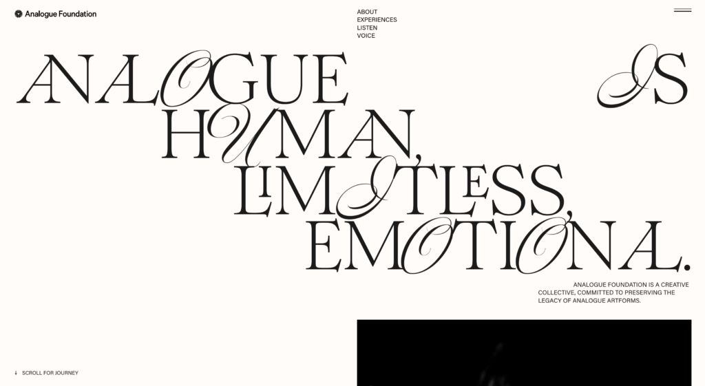
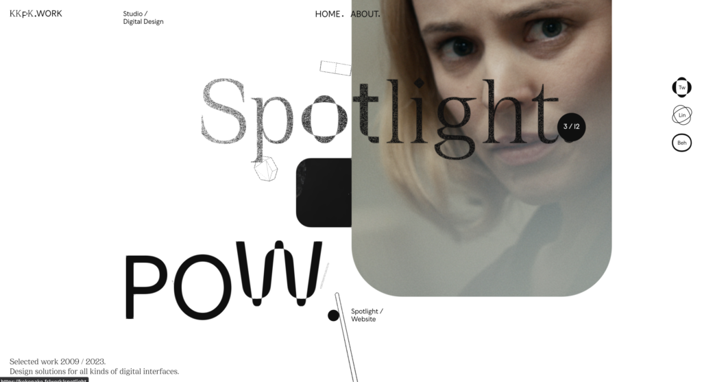
Overview of Visual Trends
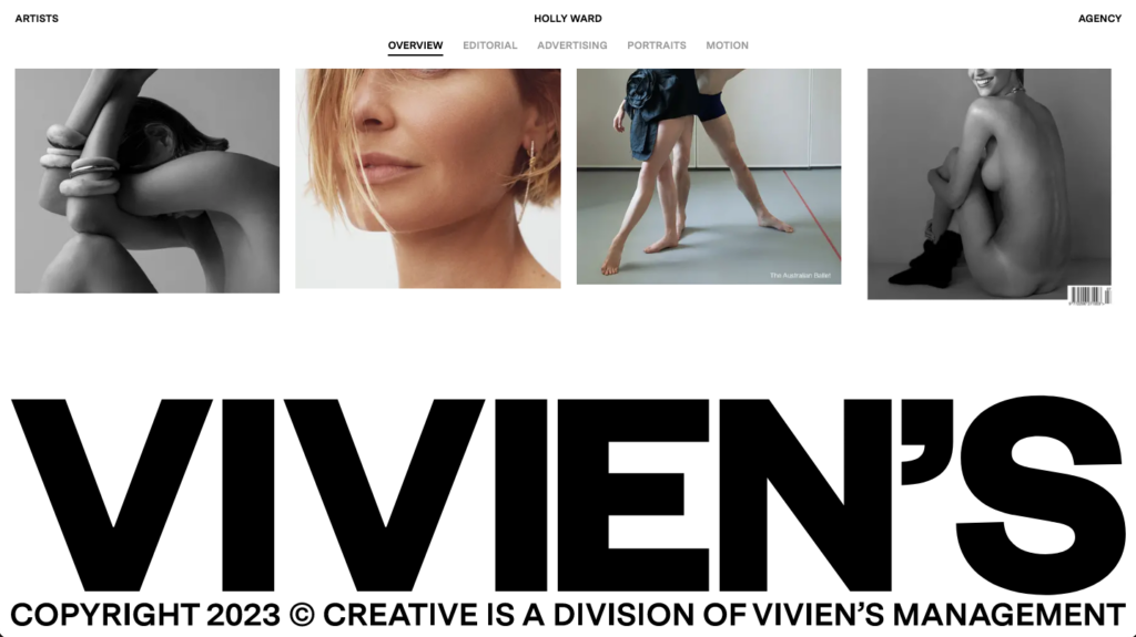
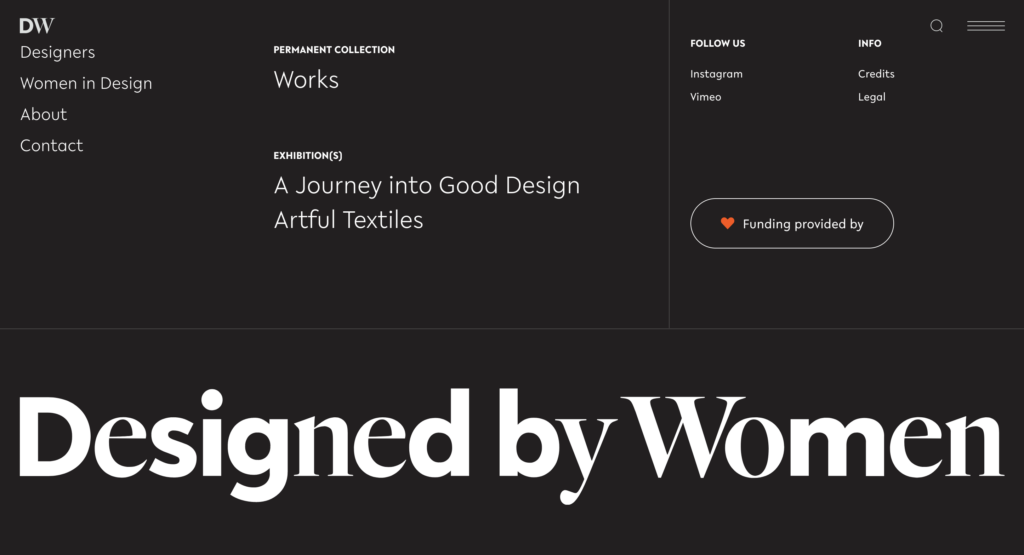
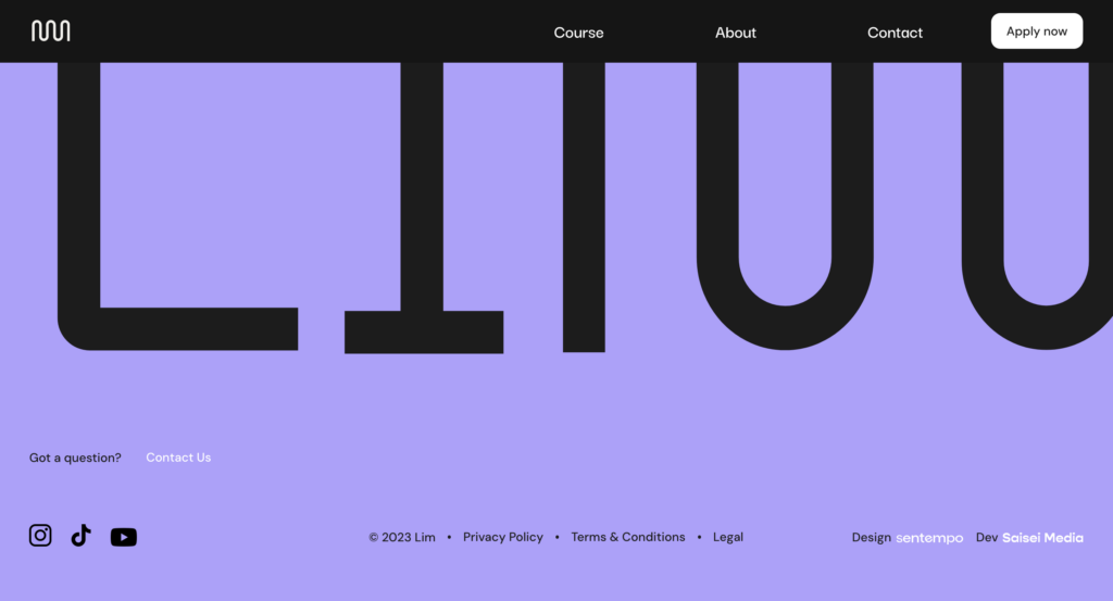
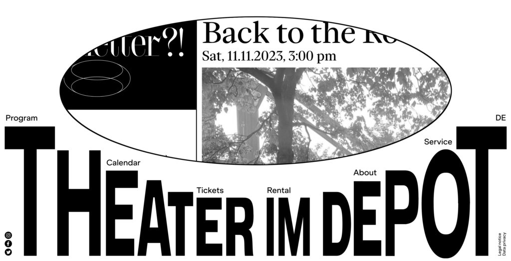
The large footer
An disproportionately large footer is now a trend. Just stretch the logo from one edge of the page to the other, and you’re good to go! You can explore footer design at a dedicated website for footers, footer.design.