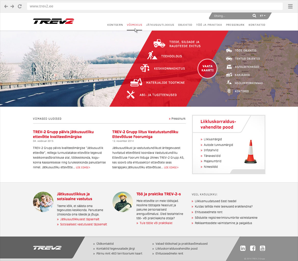
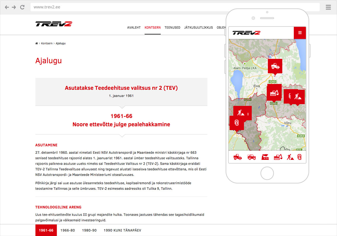
The highly experienced company, dating back to the 1960’s, gains prominence over its competitors because of its wide ranging services, innovativeness and social responsibility. In order to present the company’s values, services and experience, they needed a modern and sound website.
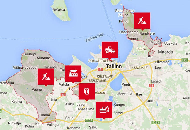
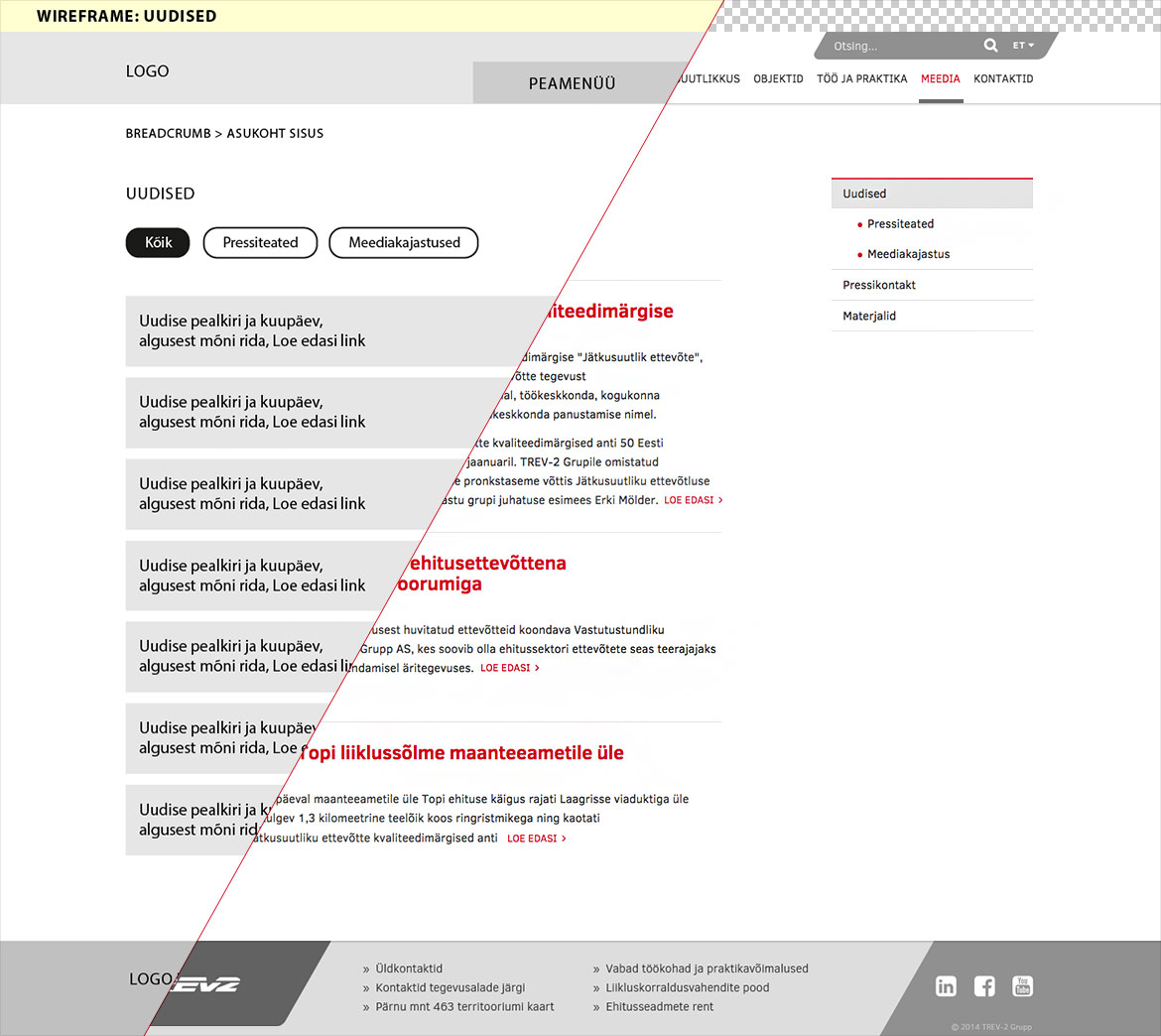
We started by creating thorough wireframes in order to discuss the layouts and interactions with the client. In visual design we were guided by the company’s style, where inclining surfaces with rounded corners and a colour palette of red, grey and white are used. We also integrated a map-application that gives a detailed overview of numerous objects in work, buildings, quarries, plants, offices and and service areas. Since the client’s wish was to present the company’s rich history, we had to make this capacious page different than usual. Navigating between different periods is faster and more convenient, compared to ordinary content page.
