At the beginning of 2016 webdesign is still dominated by minimalistically driven flat style. The most important developments are taking place in planning and development. Attention is on user experience – that is the speed and content value of websites. This article is going to give an overview of the current trends in webdesign.
Flat web design is softening and diversifying
One-page-web – a long site one can scroll. The entire website is on one page. Different menu links direct to different sections instead of loading a new page. It functions especially well on smartphones because there is no need to navigate between menu categories on a small screen or wait for a new page to load.
Some solutions also have sideways navigation. Similar to apps, new content layers appear from left or right. Or similar to computer games, the whole page moves to reveal new hidden areas. These solutions don’t load a new page as well, but it’s as if everything is happening right here, right now.
The one-page-web is often used as a tool of interactive storytelling where the user scrolls their way into the topic, both directly and indirectly. It captures the user’s attention and, at a suitable moment, call-to-action buttons will direct the user to more detailed information or action.
Alongside centre alignment there is an increase in left alignment and hybryds where alignment adapts to the content. Fewer words and big pictures suit best with centre alignment. Longer texts with lists, tables and smaller pictures etc are best aligned to the left. Full screen layout is still prevalent.
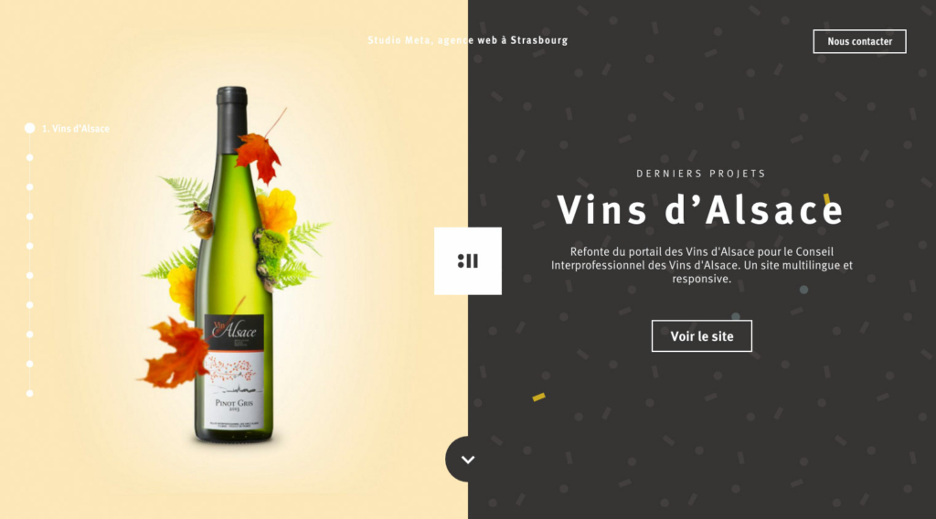
Split layout uses two columns throughout the page. Compared to last year, when these pages still used a full screen intro picture, they now also have a split front page. Read more about this.
Layout consisting of cards is still popular. The card acts as a button that will redirect to an article, picture, app etc. There are 3 fundamental ways of card layouts:
- Cards with equal width (Pinterest)
- Cards with different width form a coherent composition (Windows 8 tiles)
- Magazine style where cards have more information: picture, heading, introduction. Layouts with either one or more columns. (Facebook)
Large images. Usually there is an edge to edge introductory text with an image on the background at the top of the page. Large images are also used in the content parts. A spirited image instantly creates the desired impression.
Cinemagraph is a hot topic (again). Mainly because the new Live Photo function on iPhone. Cinemagraph is a large high-quality animated .gif image file, where some part of the image is animated while everything else stays fixed. The result is somehow timeless and stylish. So far, the fashion industry has used cinemagraph most frequently, but why not try it on your own website? Look at some examples and learn to do it yourself.

Minimalistic graphics and icons with simple forms – similar to the style of the whole page. One or two-coloured icons with equal width lines. There might be icons with more detail and animation than before but the design in principle is the same. There are more animations – both light user interface animations (Material Design, parallax effect) and storytelling through animated graphics.
At the end of each year, there are rumors of video and hand-drawn illustration making its way to web design. So far it hasn’t happened and probably won’t happen now either, as both are fairly expensive. It’s cheaper and less time consuming to combine ready-made stock graphics. But let this be a hint on how to stand out!
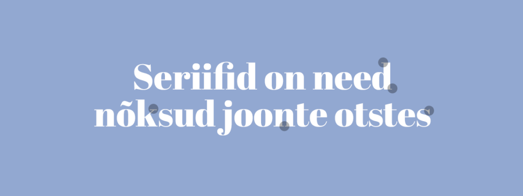
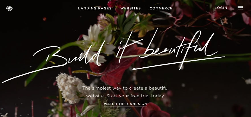
Clear typography. Large readable headings and short easy-to-grasp content. One or two fonts throughout the site. Fonts with serifs and elegant scripts are used more frequently and that trend is probably going to continue. Especially on elegant fashion and design sites. Letters with fine detail and serifs are finally properly visible on high-resolution screens.
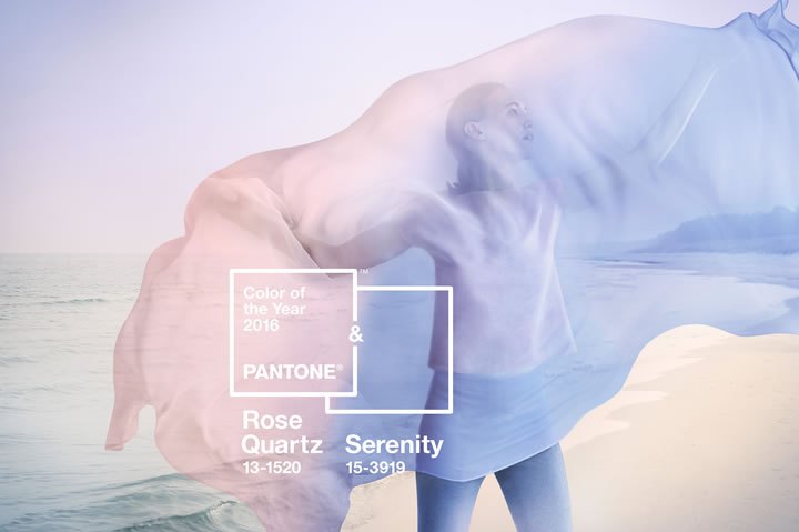
Clean colour surfaces. The colors in a modern website are bright and vivid, like in the 80’s. The trendsetter of the world of colours, Pantone, on the other hand, presents calmer and lighter tones as the trend in 2016.
Influenced by the release of Google Material Design there is a slight trend towards more material world where light and shadows exist and things move and act according to our world, subject to rules of physics. Light colour transitions are “allowed” again. The digital world is gradually starting to show textures again, but very lightly, stylishly and modestly. Natural and soft photo-based surfaces are in (marble, water surface, hills, clouds). Opposed to the 80’s, postmodernist playful, colourful and graphic geometry rocks the world of pattern.
Parallax scrolling is still popular – it just creates such a great effect! While scrolling through the page, separate parts of it move at different speeds and that produces a cool spatial effect on flatscreens. It is used either as a part of interactive storytelling or just as an effect.
Lately Apple TV parallax-effect has been a topic of interest. It gives a simple thumbnail a nice 3D sense.
Speaking of Apple, the style-guru throughout the years. Their design department is not getting tired, are they? Some of the latest design decisions might give reason to think they are?
Sticky-menu – navigation panel is always visible, usually at the top of the page.
Hamburger-menu has captured the masses lately. It means that navigation has been assembled behind one menu-icon. When there is no wide navigation strip, it leaves more room for content in phone-view and, at the same time, the menu is always just a click/touch away.
Priority navigation is a new trend – only the few most important links are always visible and secondary links are hidden behind the hamburger-icon. In some cases it’s a reasonable compromise between large computer screens and phone screens.
A vertical menu is convenient on large screens where there’s plenty of room.
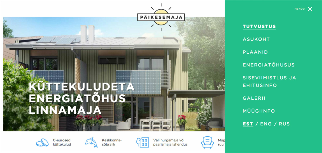
Off-canvas menu is usually a vertical menu that’s hidden behind the edge of the screen unless a click on the menu-icon smoothly makes the navigation panel visible. The menu either pushes content off the screen or appears on top of the content, like in our recent Sun House website.
Greater emphasis on user experience
The average level of visual design seems to have shot up to unprecedentedly high level. Design education is well available, the range of design tools is wide, and necessary graphics often free, while also high-quality.
Most of the things done are quite nice to look at. Since from the visual side, nothing revolutionary has emerged (AI and generative art for example are still in the experimental phase), attention has been turned towards planning and polishing the technical side.
There are two reasons for that. First, mainstream design is in itself user-centred. The needs and preferences of the users are the main focus. The designer wants to make the life of the user more comfortable and make the world prettier and better.
Second, marketing pays a lot of attention to design. Users have learned to appreciate good design that makes their life easier. Therefore, marketers, who meet their customers half way and offer proper design and user experience, survive.
The most influential so to say “customer union” and speaker for good design is Google search, on which the lives of many enterprises depend on. It is those, who are guided by user-central design, that go up in the search results.
In 2015 Google implemented the so-called Mobilegeddon algorithm. It is inspired by the fact that already over half of internet-traffic is conducted on smart devices, therefore, smartphone-friendly websites need to be preferred. In general, it means that a successful website is:
- responsive – meaning it adjusts to different screen sizes;
- light and quick, so that older smart devices can run the website as well.
Have a look at what the statistics say.
The design and marketing worlds are moving harmoniously hand-in-hand in the same direction. As a result, we see effective and calm design. In the world of visual design everything is more or less in place – consensus and contentment prevails. That leaves us with polishing the user experience.
Necessary content for the user
Ever more emphasis goes to the speed and smoothness of the site or app. The appearance and functionality of the website is largely determined by planning and development, not the designer’s rush of inspiration.
The creation of a functioning website starts with a content strategy. That keeps business goals in mind. The most important thing is actually the content on the website. Is has to be:
- necessary and useful for the user
- easily consumable
The website doesn’t need all the material there is to offer. The needs of the users should be the focus. Content and actions that the user actually needs have to be offered. All the rest is general noise that no one reads.
Think before you start – what is necessary and what can easily be left out. Then shape the content to be easily and quickly consumable.
Easier and simpler websites
All tedious widgets that add weight are out in a modern website. For example, users on smartphones tend to have very short attention span, so usage needs to be made as quick and simple as possible. A lot depends on the specific site and target group but here are the most common recommendations on what to give up on your website:
- Slider, everyone’s favourite a few years ago has now become the enemy number 1. Statistics have shown that usually slides following the first one are rarely given any attention. There are also problems with user comfort, responsiveness and weight.
- Videos are mostly useless, even though they have an effect on large screens. Informative videos on a product site, however, are in the right place because they help the users.
- Parallax-effect can, when carelessly executed, burden the browser too much and simply crash the phone. They are also more suitable on large screens and when they add value to the content.
- Social media plugins that show who has liked the page etc. No one is interested.
- “Most popular” and other relic widgets from the times of blogs.
- Large footers, where a great part of the website content is presented as a massive lump once again.
A good thing is a CTA button (call to action) that is visible throughout the page – it offers the user a chance to act. What would a user of your website want to do? Book, for example? Make that button permanently visible, so that the customer can increase your turnover at any moment!
The contacts of the real estate agent on our Piritakodu website are constantly visible. This way, the client can always contact the agent when they are convinced the place is worth a look.
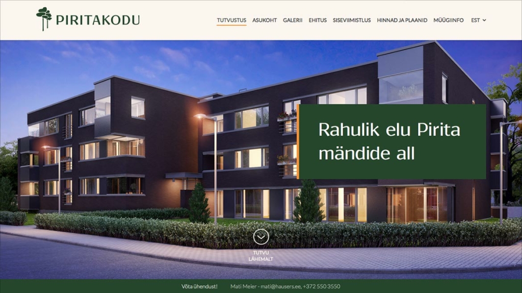
Convenience and user experience are promoted by different minor actions. These are micro-apps on the page that operate smartly and on the go. For example, booking can be done conveniently on the spot, not on a separate page. When the deal is done, the user can continue from where they left off.
Technical solutions
When content and design choices are optimized, all that’s left to do, is to do the same in development. The technical operation of websites needs to be made as easy and quick as possible. Here is a short overview of what’s hot in web development.
- Performance budgeting is an important topic – how to make the website as light and fast as possible. Loading and resource consumption of different parts of the page are planned.
- Grid systems are evolving. Bootstrap and other CSS-frameworks have served developers well, but there are other more flexible and intelligent solutions already emerging. Flexbox is quick, light and keeps the layout away from markup. Grids on demand principle is even more flexible: Susy applies grid only then and for those elements that cannot operate without. Somewhere on the background, a built-in grid support in browsers is emerging. More on developments in layout systems.
- Isomorphic JavaScript runs on both server’s and client’s side and makes the user experience very smooth.
- NodeJS that is popular in app and web development is securing its foothold also in CMS-s. KeystoneJS, PencilBlue are suitable for big corporations for whom the usual WordPress etc remain weak.
- Static websites are light and secure sites without CMS and database. When a big database is not necessary then why pull a high-flying and fast site down with a CMS? A very reasonable option for small websites. An overview of the topic and most popular website generators.
Modernize Your website!
- Test to see whether your website loads fast or leaves the user waiting for too long?
- Get in touch, we’ll help You with design, development and content design.
