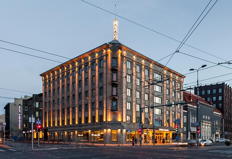
On a hot midsummer day the brief of University of Tartu virtual tour landed on our tables. We were so excited and couldn’t wait to get to work!
An exciting initial task
The symbol of not only Tartu, but Estonia, and the leading provider of higher education wished to have a fine and high-quality website with interactive maps. The aim was to create a website mainly targeted at international students, to demonstrate the compactness of Tartu and its attractiveness as a campus city. In addition to faculty buildings, other UT buildings had to be visible as well.
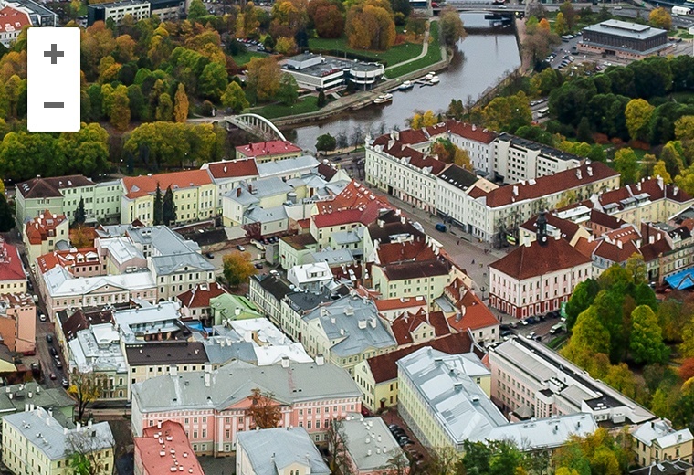
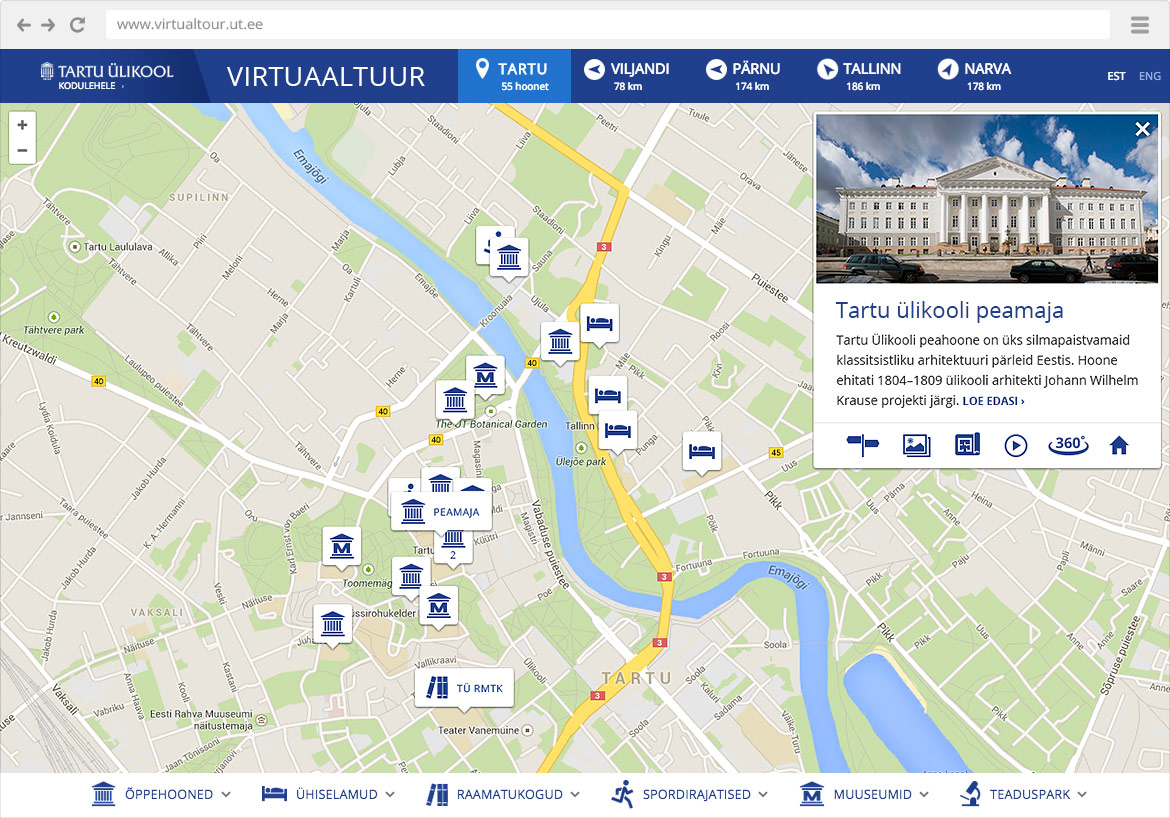
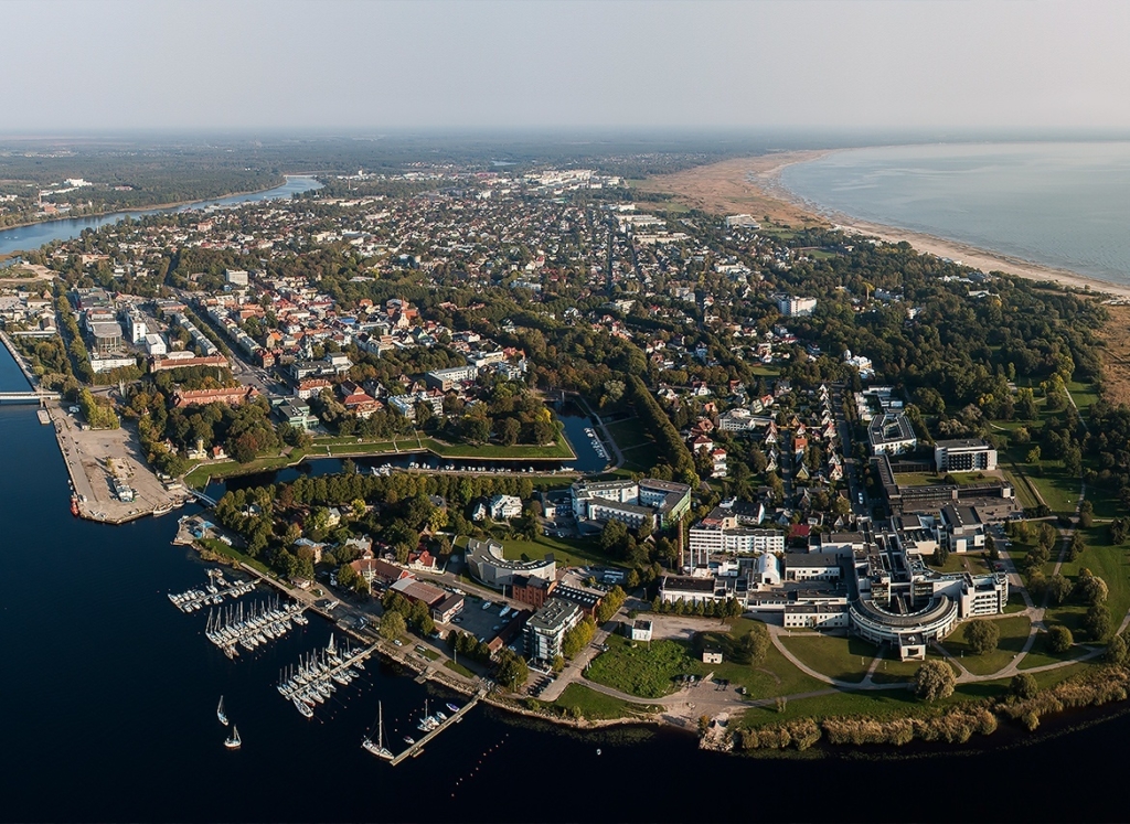
Our client’s sound vision was to present the buildings of UT in a striking birds eye view. But somehow, a map of building locations and distances between them had to be included as well.
The information on buildings and further actions, like looking at the gallery, videos, room plans and 360 degree virtual tour, had to be available.
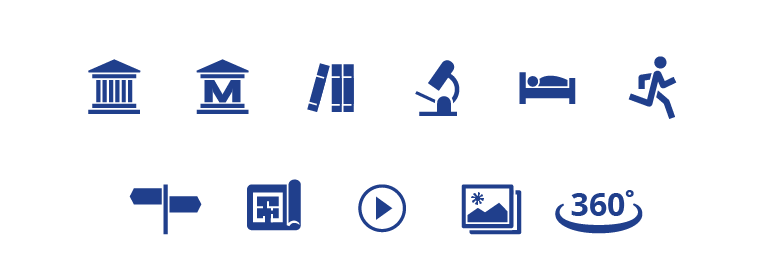
Buildings had to be distinguishable by their type (faculty buildings, dormitories, libraries, sports facilities, museums) and Maarjamõisa science park had to be presented in a separate view. In addition to Tartu, the University has faculties in other cities as well, which meant that they also had to be mapped.
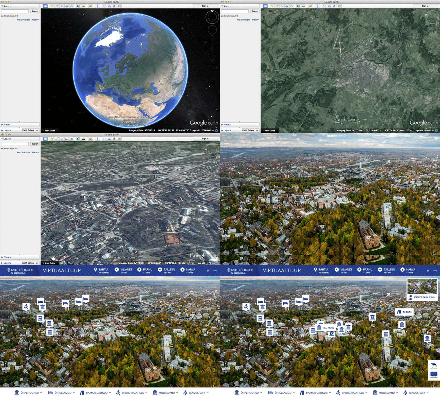
In short: layers of photos, maps and diverse detailed information had to be combined in order to create a gripping experience for the user. The content had to be easily managed through WordPress.
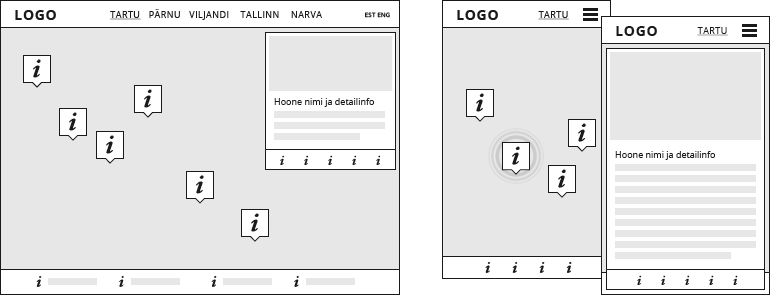
A thorough user experience design
From the user experience viewpoint the challenge was to make different information layers function smoothly. Photos, maps and texts all have different specifics and possibilities. We had to ensure that every information layer was available for the user at the exact needed moment. But we also had to avoid drowning the user under masses of information or into the depths of menus. A modern web user is very picky and demanding in a sense that the solution has to be convenient and quick to use, otherwise they just leave the site. And we can’t risk that, meaningful content has to be offered in a convenient way.
When considering design, the solution follows UT’s visual identity. Colours and fonts are familiar from their website, the design is light, clear and practical. Guided by the visual identity we designed icons for the application.
Outstanding and comprehensive aerial photos
Aerial photos and videos are a rising trend and it’s a joy that the University chose to use it. Aerial photos are effective and at the same time informative. So, a perfect choice was made regarding the solution.
We found a suitable company offering aerial photo solutions and together with the client set the desired angles using Google Earth . We made sure all the buildings needed would be visible and sent the “bird” on its way. Here we’d like to thank our partner taevakaamera.eu, who acquired all the necessary permits and was highly professional – and what’s most important – they have a fantastic drone that can fly up to the height of one kilometer!
A development based on Google Maps and WordPress
International analogues mostly use Flash-based solutions that unfortunately are very complicated to manage, technologically outdated and unusable in mobile devices. Redwall’s solution uses more modern dynamical and inexpensive solutions that work in every device and are future proof.
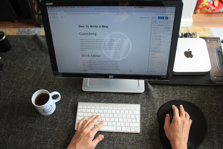
UT prefers WordPress content management system. First, we had to figure out how to bind all the options and content modules/plugins together. We installed the Google Maps application that all the necessary was linked to.
We had to plan how to make the content easy to manage. You may put together a good looking thing but if noone knows how to add or change the content, the work done is useless. The location on Google Maps, description, gallery, room plans, video and an link to 360-degree virtual tour all had to be easily assigned.
We squeezed the last out of WordPress and adjusted the system so that the content can be managed in the context of one blog article. Content editing is convenient and quick this way and there is no risk of messing something up.
Regarding front-end we had to think about making the content optimal to display on mobile devices and desktop computer screens. Regardless of the fact that the position of the buildings in different cities is varied, the aerial photos with attached objects had to comply with different devices so that the locations were properly visible. Different options were tested and the best solution remained.
