The rapid growth of smart devices and social media in the past several years means that presence in web is more important than ever. Real estate development websites have also matured and become one of the most important tools in sales.
Blog
Website as an effective tool for selling real estate
A modern, fine, convenient, and comprehensive website is a valuable tool in selling real estate.
Silver Sikk
09.03.2016
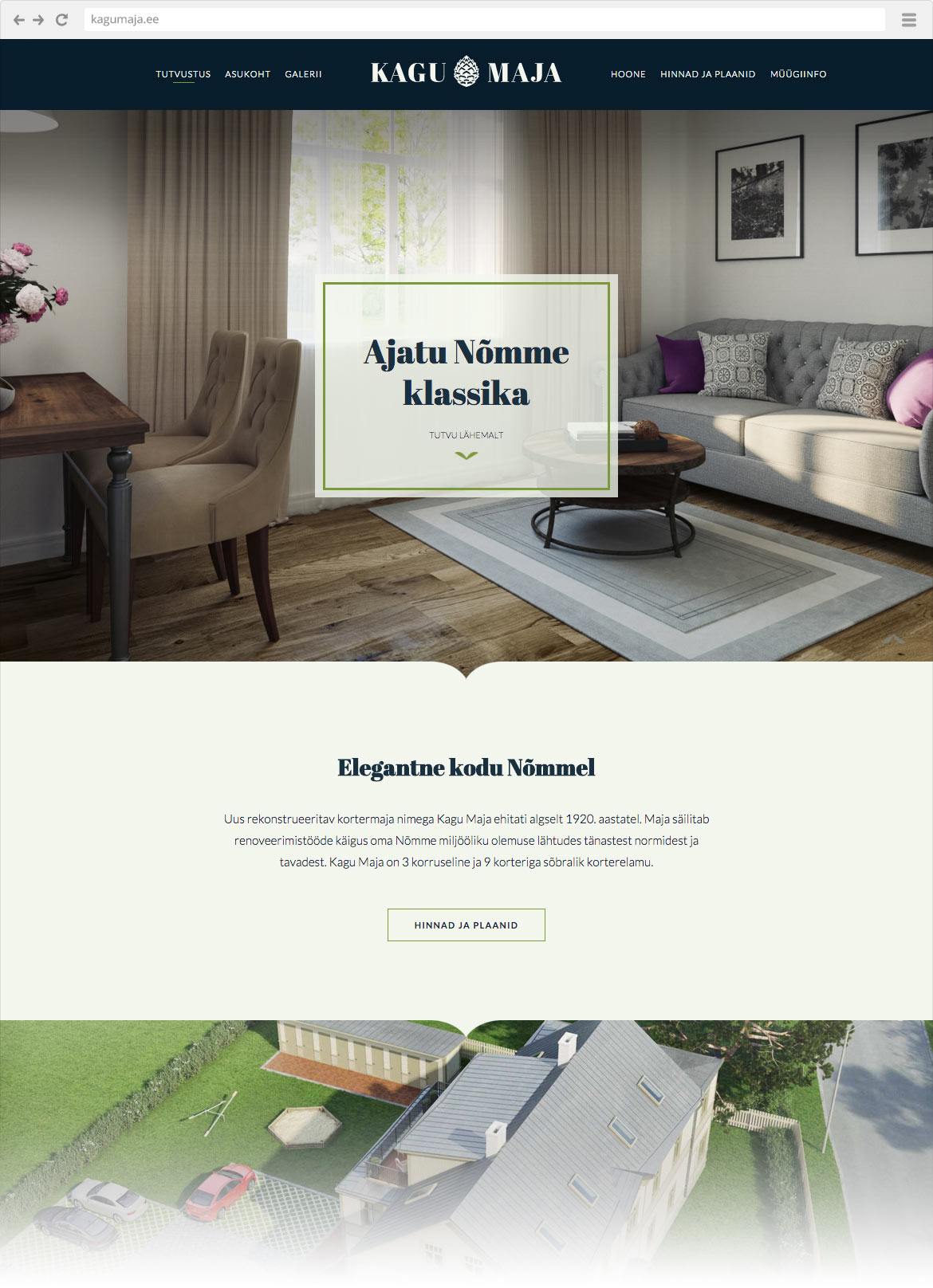
Only a few years ago, introductory text, building information copied from architect’s explanatory note, a simple gallery and contacts were enough for a development website. Now, the scene is much richer. Developers aren’t just trying to outmatch each other with new solutions and architecture, but also with their website design.
The purpose of a real estate website isn’t just to be a place to find contacts and technical information anymore. Modern website is an effective sales channel, a profoundly finished show. The website is an interactive presentation that engages the visitor in the depicted world and makes their imagination fly. This way, the potential customer is linked on emotional level – and that is the strongest link.
Sell the living environment as a whole, not just the building
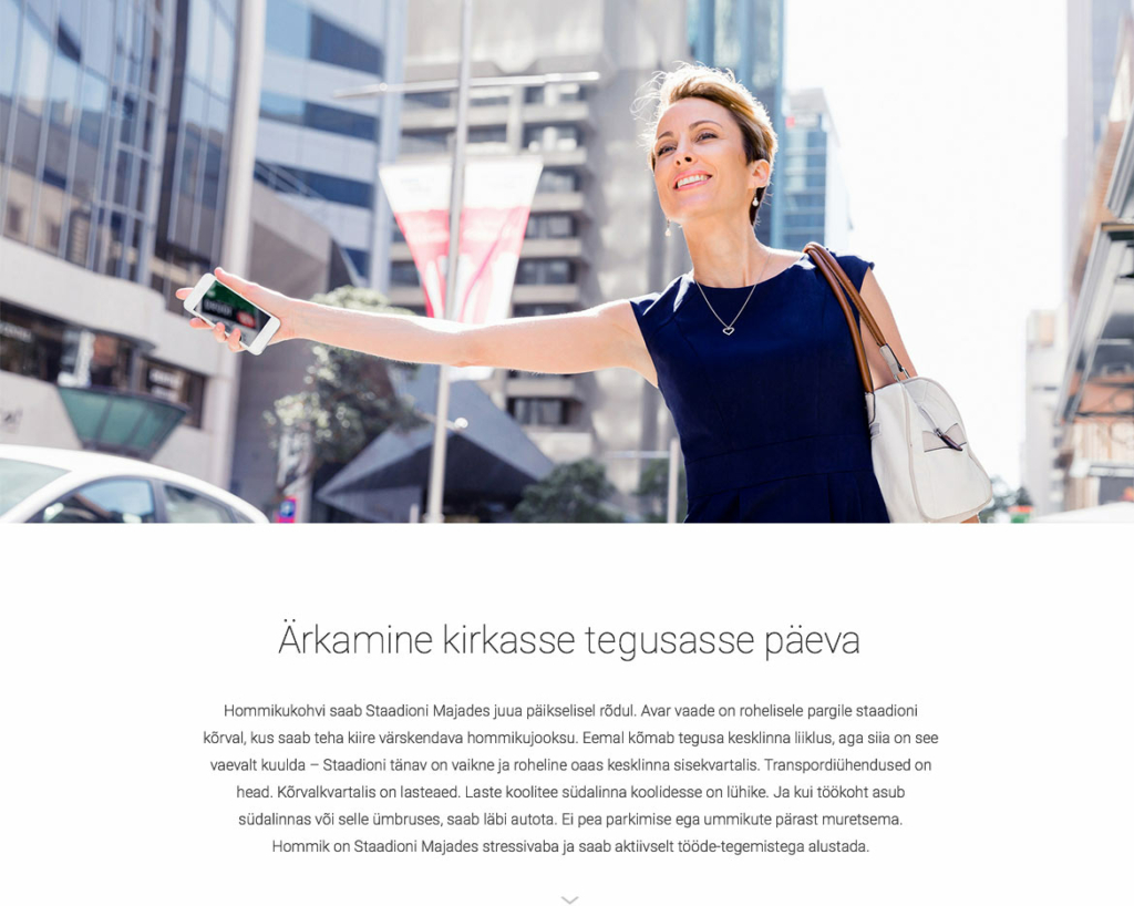
One of the most important aspects of selling real estate is the location. That’s the reason why a successful real estate website doesn’t just sell the building but offers the customer a complete vision of their future life.
The living space is, of course, very important, but customers are primarily interested in what’s outside the building. Is it a suitable residential area, is there suburban peacefulness or urban liveliness? How are the surrounding environment and opportunities that accompany living in the area?
The website should definitely give an exhaustive overview of the living environment. Plenty of photo material, complemented by short texts, should be used. A map with nearby facilities like stores, schools and kindergartens, transportation, leisure etc is very informative.
A more conscious customer can be approached on the basis of worldview or lifestyle. For example, the Sun House website we created, is focused on selling green lifestyle, and therefore, has a lot of technical information.
Large photos, 3D and videos
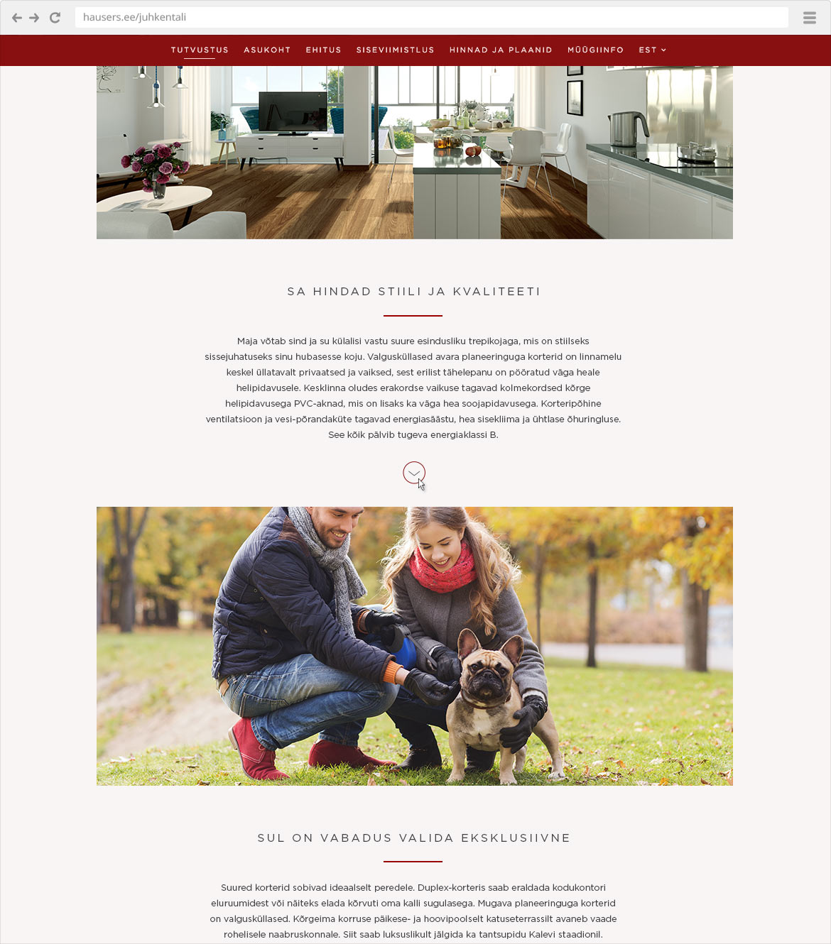
We can see many images of the environment, photos of people doing simple everyday things that the customer might dream about. For example, that you can finally walk your dog in the park just next to your house, or imagine meeting your friends in an outdoor cafe just around the corner.
The customer can get engaged through emotionally captivating photos and imagine themselves living in the environment.
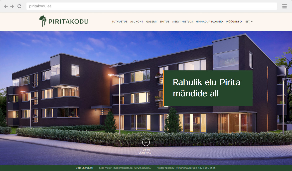
Along with photos, 3D visualisations with cozy atmosphere are used. A fully detailed 3D creates a good idea of the future home. Recollections will accompany the visitor long after they have left the website. The potential home has already become slightly more homely. All the while, the future home might not even be in the building phase yet.
Videos can also be used here and there. They are especially enticing and search engines love them.
Relevant texts
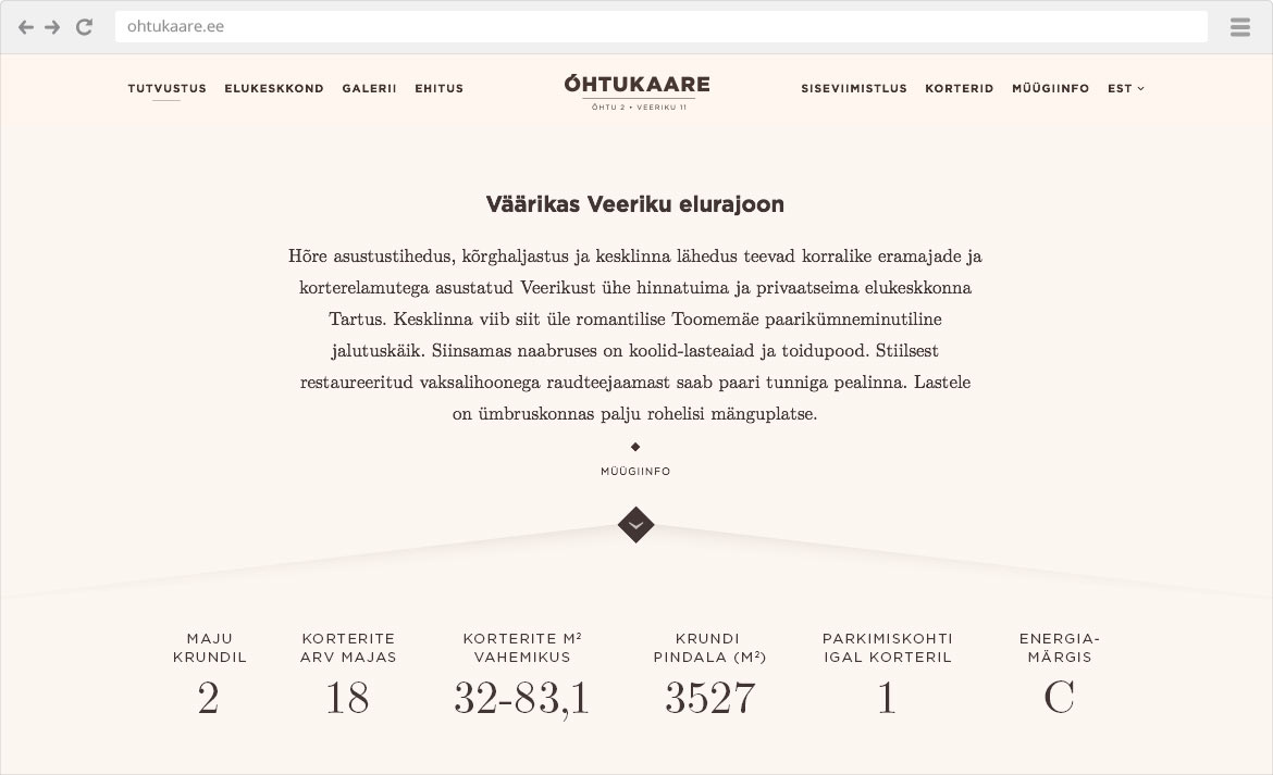
Plentiful photo material is complemented by texts created especially for web. A webtext should be short and on point.
Modern website visitor doesn’t stand meaningless chatter. You have to get to the point right away. Characteristics you want to sell have to described economically.
In order to structure the text and draw attention, plenty of empty space and icons are used. That makes the text easily consumable.
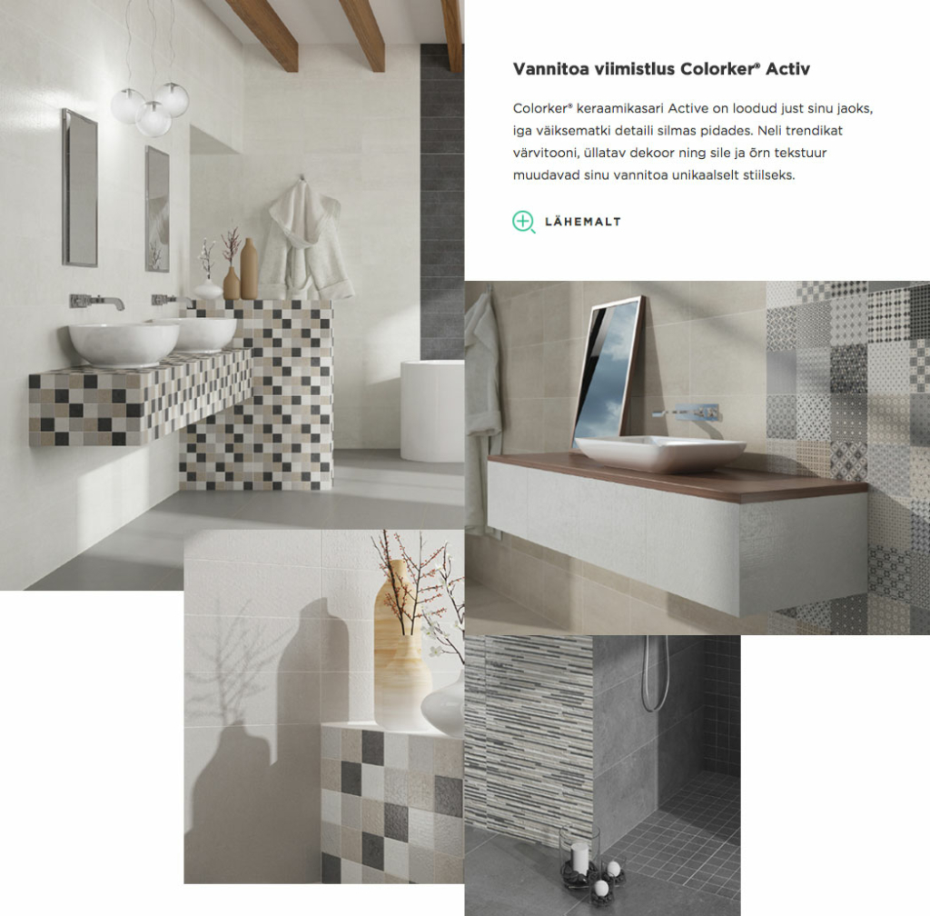
Relevant and user-friendly information
It is only after the visitor has been emotionally engaged, that more practical building information presented. Prices and apartment plans are presented in conveniently clickable tables and plans, so that the user can get a precise idea of the position of the apartment in the building.
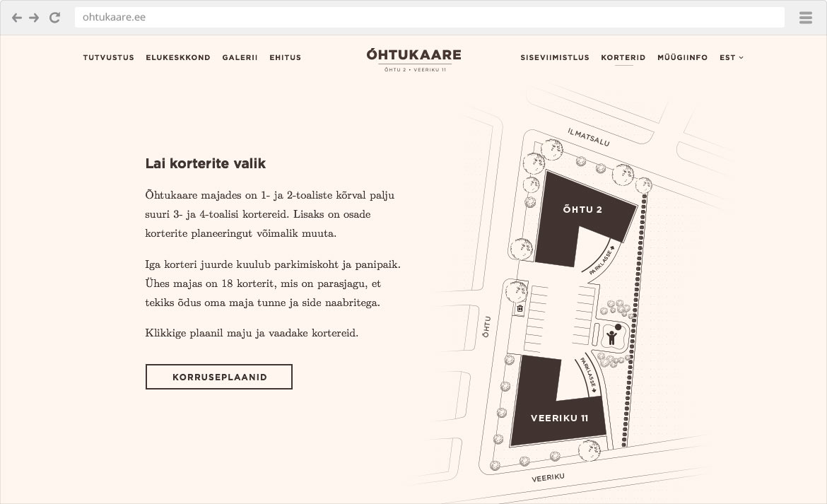
In the apartment view, different additional information and options can be presented. When making choices, for example choosing a decor package, the user makes the offer more suitable for them and links him/herself even more with the property.
When the presentation is over, there always have to be options for further action. Sales information and contacts have to be easy to find.
Proper branding creates reliability
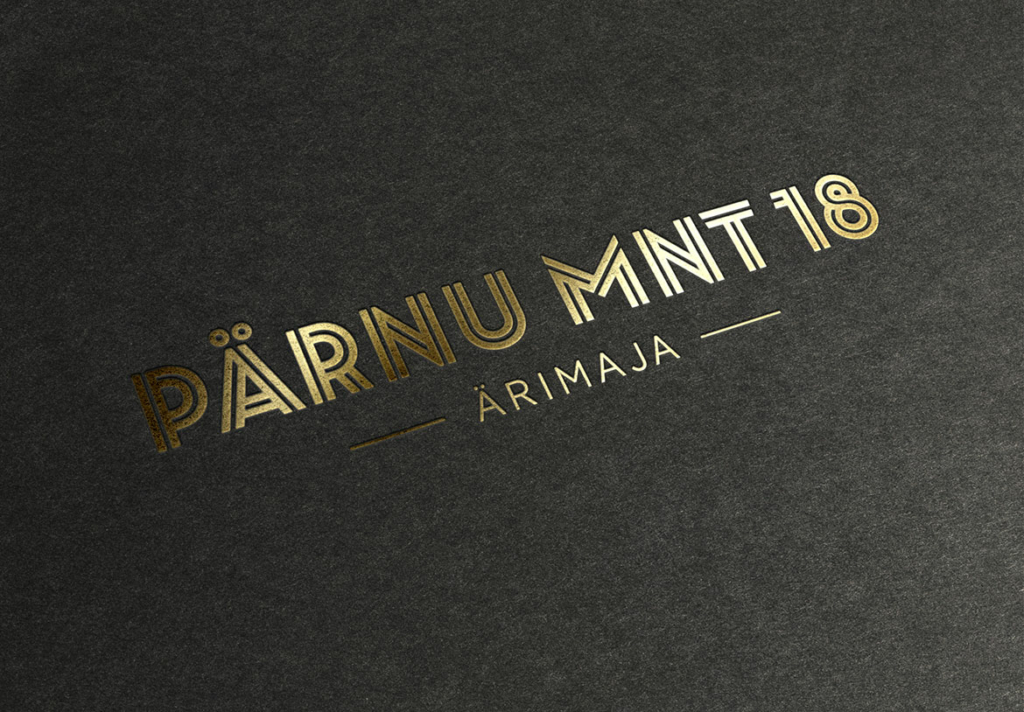
An elaborate visual identity is an essential part of every respectful real estate development. Based on location, target-group and architecture a logo and visual style that speaks to the client, can be created. And proper packaging allows a higher price.
Uniform and high-quality style creates a reliable impression and makes customers feel content for being a part of something stylish and valuable. It would be a good idea to design all other marketing materials into a uniform style with the website:
- agent’s business card
- printed presentation materials, brochures etc
- advertisements, outdoor and web banners
- social media materials (Facebook cover photo, profile picture, ad banner)
See more!
- All the views presented here are from real estate websites created by Redwall. All on these and many other examples can be found on our portfolio page.
- Some inspiration from real estate websites around the world.
