The frenzy of maximalism is fading, blending with the clarity of minimalism. In response to AI-generated synthetic "creativity," a more human, imperfect, and historically layered aesthetic is emerging. In typography, this is reflected in the return of serif fonts; in color, in introspective, deep tones.
Silver Sikk
10.01.2025
General trends
Let’s quickly jot things down and take a deeper look at some topics later.
So, the hot trends:
Realism – light, shadow, surfaces, and materials.
Surrealism – because it’s in the nature of image generators.
AI – especially hot in website creation, but also more broadly.
The human touch – a response to AI’s synthetic nature.
Minimalist maximalism – maximalism has played out; it’s time for synthesis.
Sci-fi and nostalgia – both tap into something deep within the human soul.
Menu island – the menu isn’t a full-width bar anymore, but a container with rounded ends.
Large footer – often featuring the logo in an oversized way.
Illustration – either 3D or hand-drawn.
Interactive and/or animated cursor – affects the background or is itself more expressive than a plain white arrow.
Serif fonts – seeking a sense of humanity and historical continuity. Also trending: pixel fonts, mixing typefaces, and playfully breaking rules.
Horizontal scrolling – often used in gallery sections to save vertical space. Lately, some websites switch to horizontal scrolling midway (on desktop), which surprises users, can feel disorienting, and may slow down the site. It often feels like a gimmick.
Overlay scrolling – as you scroll, elements layer on top of previous ones.
Rounded corners are the default style. Overall, a friendly visual impression is favored over dry, corporate seriousness.
Immersion – creating visually rich environments that draw the user in. More common in special projects and enthusiast-built experiences.
Neocultural Couture makes use of trendy, video game-inspired HUD graphics along the edges of the screen, glassmorphism (as seen in the DNA helix on the landing view), mouse effects, and a large footer.
Things that most new websites use anyway as best practices:
Fast page loading and smooth performance on both desktop and mobile.
Accessibility – ensuring the website is usable and understandable for everyone, including users with visual impairments or cognitive limitations.
Minimalism, and more broadly, a clean and clear overall impression.
Microinteractions – small usability details that indicate when an action is possible, in progress, or completed. This includes animations, transition effects, toggling between dark/light modes, animated cursors, and more.
No-code development – although around 40% of the world’s websites run on WordPress, recent years have seen a surge in user-friendly, affordable website builders like Webflow, Wix, Squarespace, Framer, and others.
Dark mode – many websites are now designed with dark themes or offer a toggle between light and dark color schemes. It’s also good development practice to respect the user’s system preferences; for example, if a user’s operating system is set to dark mode, the website should adapt accordingly.
In addition, there are things that have been expected to go mainstream for several years now. Many of these trends are mentioned in annual reports and roundups year after year, yet they appear on only a tiny fraction of the 1.1 billion websites currently online. So, these are more expectations than actual widespread directions—some even count as failed trends.
Voice-controlled technology. Still clunky for most everyday tasks. However, it’s a great alternative in certain contexts—especially at home or on the move.
Data protection, personalization, ethics, and sustainability. Avoiding user manipulation, being transparent about data usage, and choosing solutions and service providers that consider the environmental impact of the digital industry. Here in the EU, things are relatively well-regulated, but globally, the green shift seems to be turning into a green rollback. Facebook has abandoned fact-checking, and AI is clearly enabling even more sophisticated manipulation. Sadly, progress tends to happen only insofar as it benefits Google rankings, visibility, and sales. Still, you can take even a small first step—test your website’s energy use and take action!
Augmented reality. Apple Vision Pro landed with a bang but quickly faded from the media spotlight. Facebook also once had grand plans to take over reality. For now, AR remains within the realm of tech enthusiasts. It’s simply impractical for the general public. E-commerce leaders are offering experimental AR experiences via mobile, but more as marketing gimmicks than standard services.
Blockchain technology. Wait, what was that again? Most people still find it confusing—maybe they’ve heard of NFTs or decentralization, but the connection to design remains unclear at best.
The way we use the web is changing
The way people use the internet is changing. Instead of browsing the web themselves, users are increasingly relying on AI-assisted experiences—like summaries and recommendations generated for them.
Where users once navigated through a web of interlinked pages, typically starting with a search engine, they now often settle for a summary provided by the browser, search engine, or an AI assistant. Google now says it doesn’t just want to help you search—it wants to Google for you.
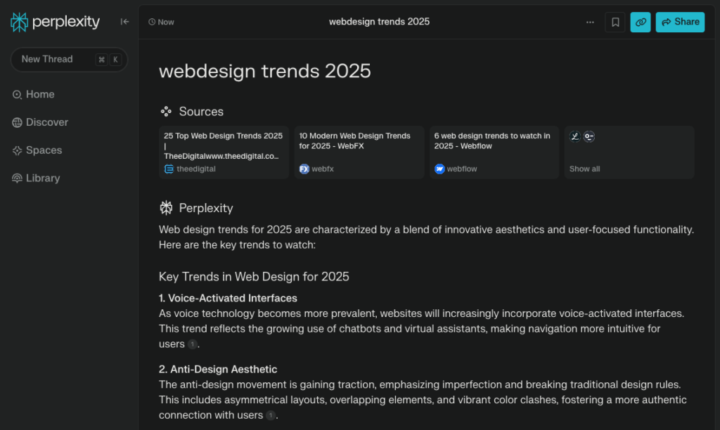
Already today, platforms like Google (though seemingly not yet in the EU), ChatGPT, and Perplexity offer a conversation-style interface instead of traditional search results. Users can ask questions, and the responses are synthesized from search results into summaries. In the Arc web browser, for example, hovering over a link shows a brief summary of the linked page without having to visit it. While on a page, users can even chat with an AI about its content.
A typical Google search about trends already provides a topic-based summary right at the top. True, for now it mostly just links to articles—some of which are quite outdated.A search on Perplexity about trends provides a written summary along with sources. Still, the quality can be inconsistent. It’s often better to rely on a human-written article—curated content, so to speak—rather than something stitched together by AI.
This fundamental shift—from links to summaries—will likely, at some point, transform websites themselves.
The way websites are created is changing
When it’s not users surfing the web anymore, but their AI assistants, the web shifts from being a space for humans to one designed for machines.
Social media and entertainment will, of course, remain visual and tailored to human perceptions and desires. But for something like cooking pasta, you can now figure it out directly from a search page without ever visiting a recipe site. For everyday information, human-readable websites may no longer be necessary—machine-readable formats are enough.
Furthermore, the general AI-driven generation and personalization of websites will lead to a future where there’s no longer a single “set-in-stone” website for all users. Instead, there will be different versions for different user groups. While a traditional website today is still quite static, with occasional updates, in the future, an AI-powered generator will create a website tailored in both content and design to each specific user on the fly. Initially, this will likely impact e-commerce, journalism, and other websites with dynamic content.
An entirely separate topic is website builders. No-code web applications have already made creating websites accessible to everyone. Now, AI is being integrated more and more to assist in setting up websites. Similar to the legendary Microsoft Clippy, these AI-powered assistants help with the website setup and even populate it with content.
A glimpse into the web designer’s desktop shows that AI has reached a fairly mature stage. It can now be used in design work. In addition to general image generators, a host of specialized tools have emerged.
The models behind them are usually still large and well-known, but the user interfaces are now more suited to designers’ needs, allowing for fine-tuning rather than just randomly generating new variants like before. There are photo, illustration, video, audio, 3D, branding, UI generators, website builders, and more. Increasingly, these tools are not only useful for idea development but also for finalizing the design.
The issue of copyright in AI training, which has been a concern, is also being addressed, and various funding models are being tested. The market leader, Adobe, takes responsibility for this, and a good example is Exactly, a platform focused on illustrations that allows users to easily generate illustrations in a specific brand style. The illustrator who created the style is also compensated for their work.
Surrealism
Visually, we’re seeing more dreamlike scenes and unexpected combinations. This, of course, comes from AI, which allows for quickly and convincingly mixing anything the imagination desires. At the same time, it has brought previously hidden illustrators and artists with interesting styles into the spotlight. The unusual is no longer something to fear. As a result, people’s horizons and capacity for acceptance have generally broadened, and the world feels richer.
Well, those image generators are fun toys, no doubt. But it’s worth noting that for some reason, when it comes to AI “creations,” there’s this default assumption that if the result is a mechanical absurdity or predictable banality, it’s still somehow instantly cool. It’s always been possible to combine different elements, so where were all the “surrealists” before? I guess convenience wins, and everyone’s doing it…
Too much annoying AI surrealism…
Realism and spatiality
There are several topics and techniques for bringing realism into digital environments. What’s different from the past is how sensitively and dynamically effects are being used.
Glassmorphism – semi-transparent, almost frosted or matte glass-like elements. This technique is now used in Apple and Windows operating systems and has spread to websites as well.
Light halos and similar effects are often linked to mouse cursor movement, creating a realistic impression.
Falling shadows from off-screen objects have been present in graphic design for years, and now they’ve made their way into web design.
Textures are subtle and remain in the background.
3D spaces are being navigated or zoomed into, for example, in simpler galleries.
The parallax effect has long been a known technique, but it still creates a convincing illusion of spatial depth. Objects in the foreground move faster during scrolling than those in the background.
Daylight uses animated shadows to create a sense of spatiality, including in opening videos, and incorporates movement along different axes during scrolling.
Human dimension
In response to the digitally flawless, colorful worlds created by AI, there is an increasing appreciation for its opposite: the human, physical, tangible, intimate, imperfect, and detailed. Real experiences and stories stand in contrast to the AI-driven statistical average. Craftsmanship, human touch, tradition, authenticity, sustainability, and slowness are valued. This is especially prominent in branding, illustration, and likely remains confined to a narrower niche.
Even in the trend overview of the more creatively inclined image bank Stocksy, similar keywords appear: low-fi technical imperfection, random yet unexpectedly captured compositions, natural everyday situations, stories, people, and moods from all walks of life, intimacy.
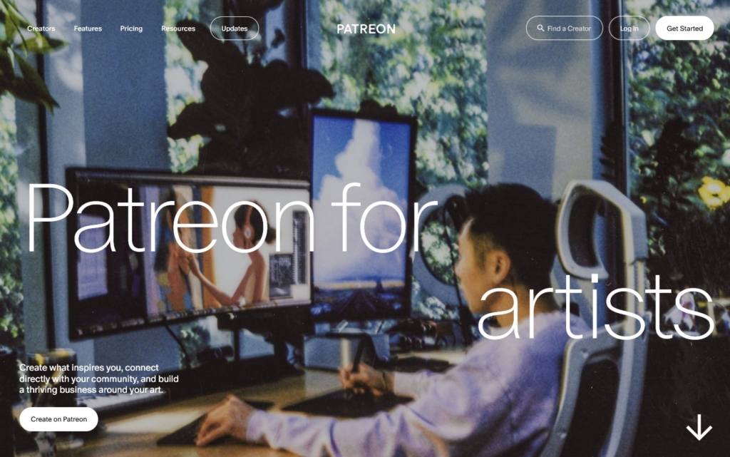
Patreon uses many images of people on their website, employing a so-called “random quality” style.
Minimalist maximalism
The clarity and simplicity of minimalism have dominated since the 2000s. Over the last decade, brutalism with its anti-design approach, along with nostalgia and maximalism, with its emotional, creative use of colors and fonts, have enriched the visual landscape. Now, a certain mix of all these elements has settled in.
Clarity is key, but now it’s no longer stiff and in dull tones. At some point, the volume is turned up with colors, fonts, and illustrations to keep it fun! This is especially common in sensual, creative, and health-related fields.
Wild Thingz – bold and fun theme presented in simple, clear slides.
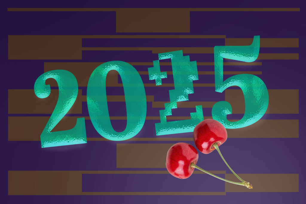
Sci-fi and nostalgia
Raging technological progress always brings utopias and science fiction with it. The space optimism of the 1950s and ’60s was one example, and in some ways, we are also witnessing it at the dawn of the AI era. Websites dealing with cryptocurrencies have been among the leaders of futuristic design in recent years, but now we’re seeing a trend toward a more nostalgic and warmer sci-fi atmosphere, drawing from the very same 20th-century sci-fi genre.
Instead of abstract and inhuman crypto worlds, we now see sleek superheroes adventuring through epic landscapes reminiscent of the Grand Canyon, enriched by television tower-like architecture and retro video game elements.
In recent years, the elegant and psychedelic Art Nouveau-style decorative fonts are being slowly replaced by more solid serif fonts. On one hand, there are classic book fonts, while on the other, more intense slab-serifs, chisel-serifs, and similar fonts are emerging. Forgotten hits from the past are being revived. Check out more about typography trends.
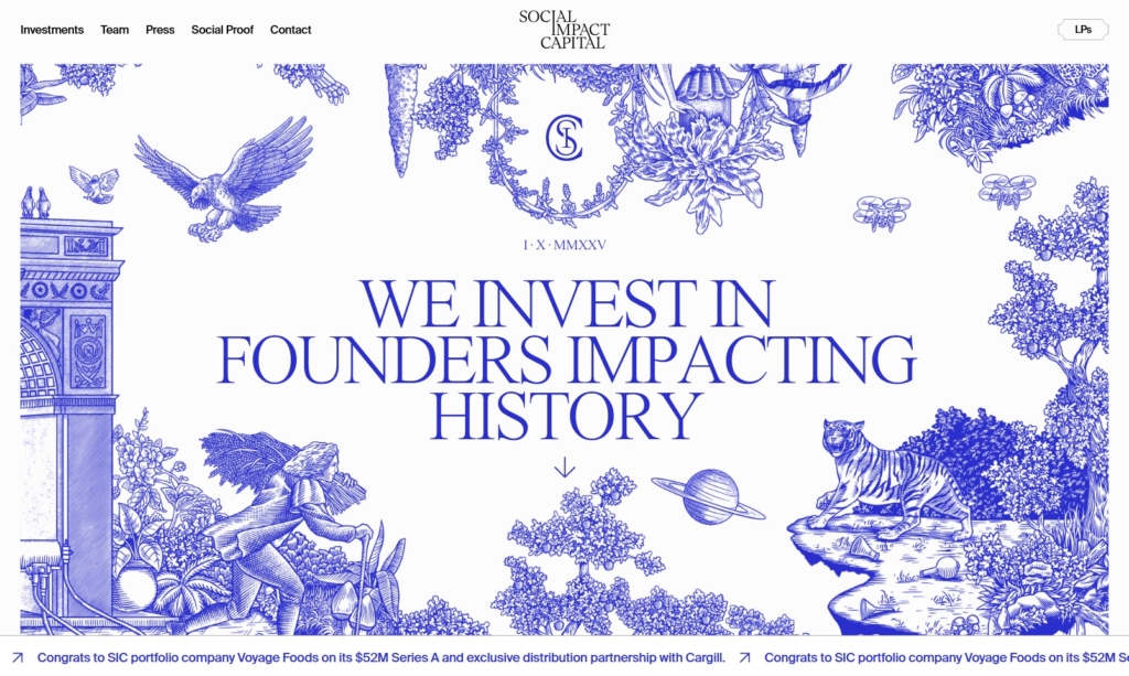
Social Impact Capital is in a truly classical style, both in its use of fonts and illustrations.
Immersive Garden – in addition to the serif font, there’s also a sensitive use of materials and space.
Interestingly, AI serviceproviders use serif fonts to emphasize humanity and naturalness.
There’s experimentation with the variable font format, where many different variants are compressed into a single font file. For example, Marbla – seemingly a standard font, but with its own quirky inflated version. Or moving along the axis between block font/serif font. Or, in the case of block fonts, a geometric and grotesque variant. Or various optical variants (e.g., using different levels of detail in headlines and body text designs). More of these “Swiss knives” are being offered, some genuinely useful for designers, others just experiments.
An emerging trend is the use of fonts inspired by everyday life and DIY aesthetics. It’s a carefree, rule-defying approach. For instance, techniques from fonts designed for specific uses (such as microfonts or stretched fonts made for writing on asphalt) are now being applied to regular headlines.
For probably another year or two, we’ll primarily see pixel fonts in headlines, often combined with other types of fonts. Mixing fonts, in general, is still very much a trend.
The most common in web design are, of course, neutral block fonts. The trend for geometric shapes is over; now block fonts are either neutral or have a 19th-century grotesque style.
Deep, rich colors
The screaming primary colors of brutalism and the neon rave hues of the ’90s are pretty much played out; it’s time to calm down. Pantone’s color of the year is the conservative and cozy cocoa brown Mocha Mousse, while WGSN offers a dark mauve-gray called Future Dusk. If you also look at interior designtrends, the general direction toward home comfort, meaningful details, ties to the past, and rich layers is definitely in the air.
This could also be reflected in web design, right? At least in the fields of fashion, beauty, tourism, and healthcare, softer textures and lighting would fit perfectly. And for some law firms’ websites, burgundy velvet, patterned rugs-curtains, brown furniture, with patina details as accents, would suit just fine.
The reality is, of course, that colors are used according to branding or industry, and they don’t depend so much on the seasonal fashion colors. This is why you still see mostly whites, grays, and pastels, with accents of blues and purples that work well on screens. One particular obsession among web designers is bright indigo gradients.
Header manipulation
Scrolling effect, which seemingly stacks content on top of each other. Typically, thumbnails, tags, or other smaller elements are stacked, but here, this effect is applied to the entire website:
Figuré.e festival –the page blocks are stacked one after another as you scroll.TechSpeed – a typical use of the effect, applied only to individual elements.
Conclusion
Web design is inevitably linked to fields and people who push boundaries, invent new products and services, and are like modern-day explorers. Therefore, web design is primarily driven by optimism, it is digitally futuristic, sleek and clean, polished, clear, and precise.
On the other hand, there is a sense of withdrawal and introspection. In politics and the economy, times remain anxious, and in the influential AI field, alongside new opportunities, there also appear to be threats. In visual design, retro has almost reached the threshold of the present, so it feels like there’s not much left to draw from.
Thus, in the midst of confusion and all the possibilities, we delve into ourselves and the exploration of AI’s impossible opportunities. Let’s maintain our core, but also avoid isolation!