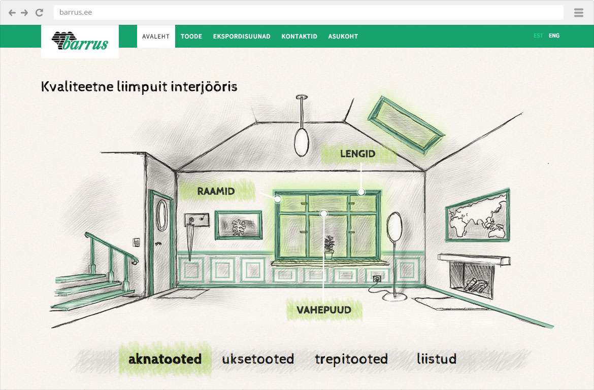
While the artistic solution of the previous homepage design was exciting for its time, the problem originated from its inconvenient navigation and unnecessarily bulky information architecture. The combined effect of that made it impossible to control the client’s path to required information. Also, essential messages had not been defined or emphasized.
It was a very exciting challenge for us, reaching far beyond the conventional web design. Our task was to talk over and filter out in cooperation with the client the main goals of the web, substantial messages and provided information, so that it would fit within the overall marketing strategy and activity context of Barrus. Relevant information had to be distinguished from irrelevant – being not an easy task, as there was plenty of exciting technical and product information. The process concluded with a merely one-page website as opposed to the earlier one of fairly bulky and complicated information architecture and navigation system. At first glance, it seems brief, but achieves precisely its goal – focussing on the essential, communicates what needs to be communicated. The user is not burdened with the unnecessary – less is more.
