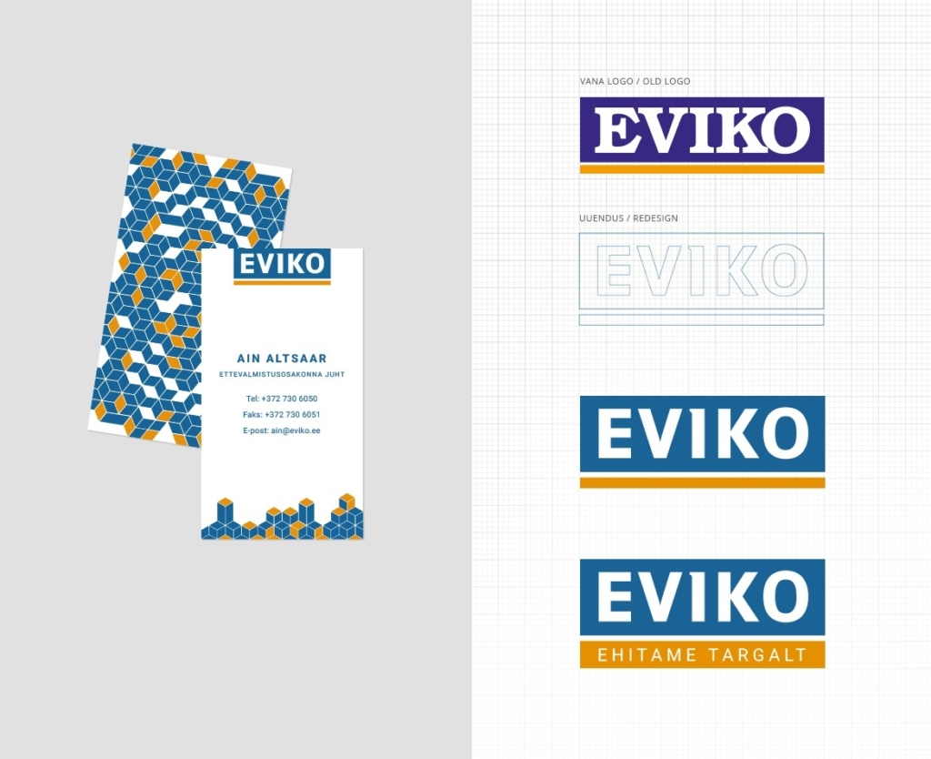
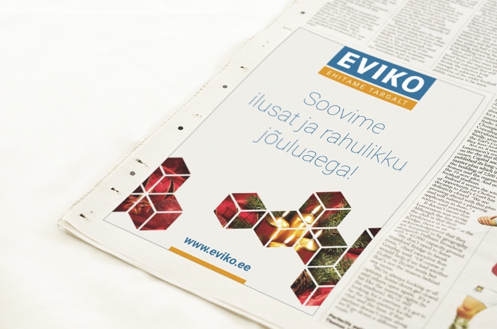
During the style updating we updated the logo and made graphical elements that connect Eviko’s presentation materials, vehicles, labels, advertisments, web, etc. to a clear visual system. Since the logo was known in this area, it was decided to leave the logo’s main shape the same and make it more modern and clear. The cubepattern was created which mirrors the company’s rationality, precision and flexibility through its modularity and rationality.
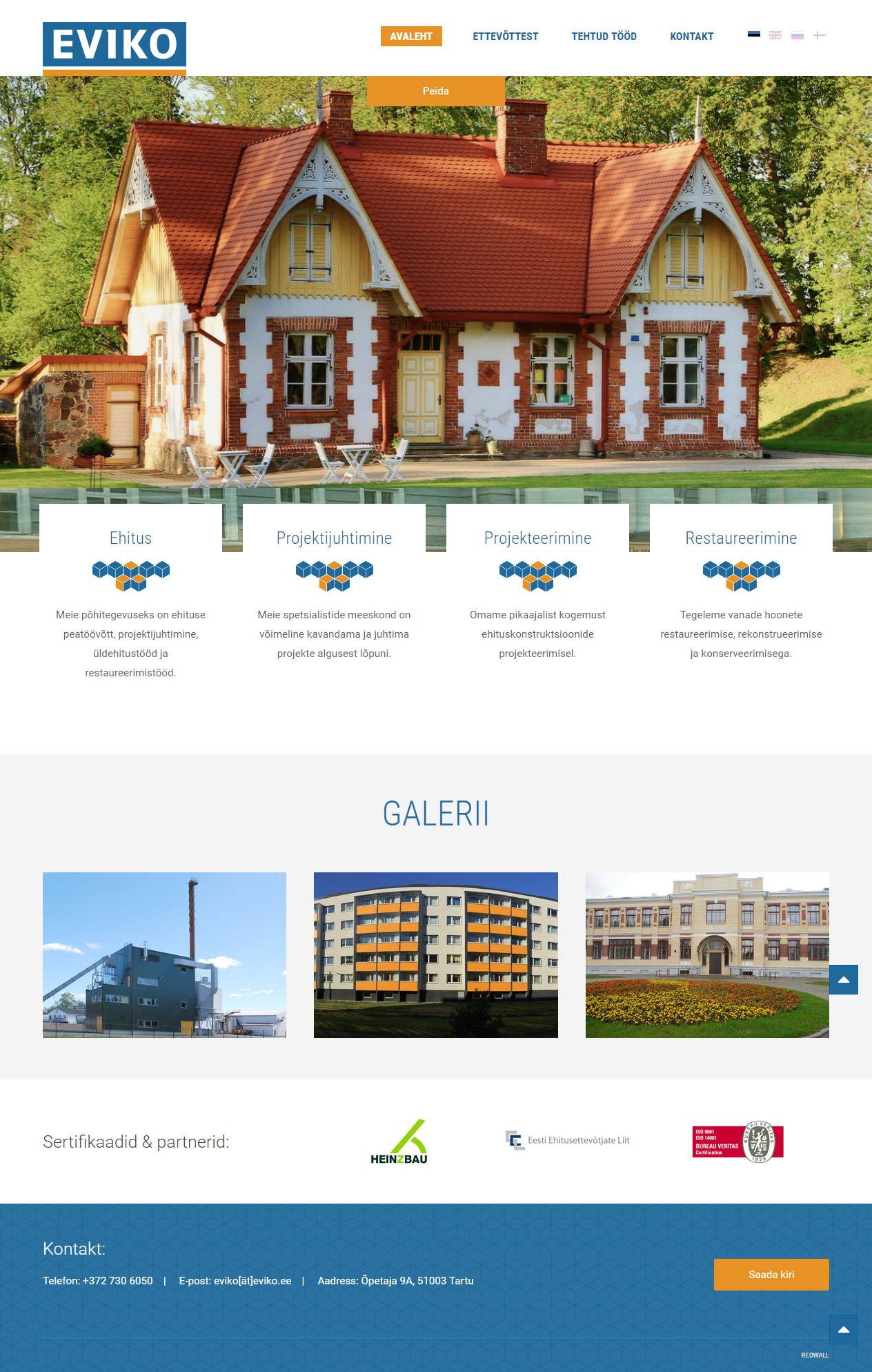
The main goal of updating the web page was to have dignified represenation on the web and to make it more compfortale to display voluminous collection of references. New webpage follows Eviko’s modern and solid image both aesthetically and technically.
